Three months to rebrand a global company. #2
Who do you trust with a decision everyone has an opinion on?
Put an entire board in a room and ask whether the website should be purple or orange. Tell them they must all agree.
Come back in two weeks. They will be blood stains on the wall, and still no decision that would have convinced anyone brave enough to go for another round.
Or you may simply find very tired people who have developed an unexpected interest in beige.
This brings us to ownership, a delicate subject that follows you through every stage of a rebranding, right down to whether the main homepage headline needs a full stop.
Everyone can have an opinion. Someone still has to make the decision.
Bain’s RAPID framework makes a useful distinction between the people who contribute to a decision and those responsible for making it. Those roles can easily become blurred when the subject is something everyone feels qualified to judge.
A colour, a photograph or a headline gives almost anyone an immediate reaction.
The harder part is deciding how much weight that reaction should carry.
Does it reveal a problem for the audience, a constraint we have overlooked, or simply a personal preference?
“I don’t like orange” is perfectly legitimate feedback. It just needs a little more work before it becomes a business argument.
Kristoffer, Lucien and I brought different perspectives: design, company ambition, and the way we needed to explain that ambition to the outside world. We had to turn those perspectives into a coherent brief and feedback that someone could actually act on.
It also meant accepting that being close to the company did not automatically make us the best people to imagine every part of its future identity.
Sometimes, knowing the company is also what gets in the way
In French, we have an expression, avoir la tête dans le guidon. Literally, having your head down over the handlebars. You are pedalling very hard, but your view of the landscape is becoming somewhat limited.
We knew our product, our customers and our internal debates. We also knew all the reasons an unfamiliar idea might be uncomfortable. An outside partner could challenge things we had stopped questioning.
Design researchers David Jansson and Steven Smith studied a related problem in their work on design fixation: existing ideas can constrain the solutions people explore. Their research concerned design tasks, but the parallel is easy to recognise when you work inside a company.
You become very good at explaining why things are the way they are. Eventually, some of those explanations start sounding like rules.
An outside partner has assumptions too. But they can ask why something has to stay a certain way without remembering the six meetings that originally put it there.
Sometimes, that is exactly the question you need.
Of course, first you have to find that partner.
Finding someone willing to join the expedition
Agency websites are an experience in themselves. Some make you wonder whether you are buying a design system or applying to join an experimental art movement. Others tempt you into saying, “I could do that,” a sentence that has probably preceded quite a few professional disasters.
Looking past personal taste, we needed a team capable of understanding a difficult brief, working at our pace and delivering something we could use.
There are only so many agencies eager to work with a scale-up that does not take many breaks, arrives with more conditions than its own terms and conditions, and offers a timeline that makes quality assurance feel like a competitive sport.
Some doors closed. Some emails became quite firm.
At times, it felt as though we were looking for a sponsor for an expedition. Someone willing to put their sticker on the equipment in case we actually made it.
That partner was Bleed.
The Oslo-based studio works across strategy, identity, digital experiences and physical environments. Its portfolio moves between technology, culture and consumer brands, with recognition from organisations including the Art Directors Club, Type Directors Club and European Design Awards.
Awards are reassuring. The more useful question is whether the work behind them tells you anything about the problem you are trying to solve.
Their work for Sanity offers a particularly relevant example. The brief involved expressing Sanity’s position as a content operating system while speaking credibly to both marketers and developers. Bleed combined an expressive visual language with a structured technical framework, extending the identity across product and communications.
Different audiences, different expectations, one system. You can probably see why that is relevant to our story.
Avo Consulting illustrates another challenge. Bleed created its initial identity in 2019, then revisited it five years later as Avo became a more established consultancy. The refresh retained the recognisable logo while expanding the visual system to reflect a more mature business without losing its playful character.
Growing up without becoming anonymous is a fairly good ambition for a brand.
Those projects show two abilities that mattered for our brief: making complexity understandable and giving a company room to evolve while preserving its personality.
Before deciding what we should look like, they took time to understand who we were
What I appreciated in our own collaboration was that Bleed started with the business.
They looked at the market around us and the different people we needed to speak to.
Through conversations with our leadership and working sessions together, they helped us examine the gap between what we were building, what we thought we were communicating and what someone outside the company could reasonably understand.
Those are three surprisingly different things when you have spent enough time with your head over the handlebars.
With a deadline approaching, that can feel uncomfortable. You want something visible to react to. A homepage. A logo. Something you can point at and say, “Good, we are moving.”
But a design can be beautifully executed and still answer the wrong question.
Bleed gave us different ways of positioning the company to react to, each with implications for the audiences we would reach and the expectations we would create. Discussing those choices helped us articulate what mattered, what we could credibly promise and what we were unwilling to lose.
Their work with Selective Music provides an interesting parallel. In a testimonial published in Bleed’s case study, founder Mike Herbrik describes finishing the process with a deeper understanding of the company and its direction. The identity itself drew on early-1990s punk culture while retaining a professional presence, and received recognition from the Type Directors Club, Art Directors Club and Visuelt.
A music company and an enterprise events platform have rather different briefs. But helping a team understand itself clearly enough to communicate with others is valuable in both.
Without giving away Bleed’s working methods, that was the value of the process for me. They guided us towards conclusions we could understand, challenge and eventually own.
By the time we moved into the identity, we had a much clearer idea of what we were asking it to express.
What do people understand when they look at you?
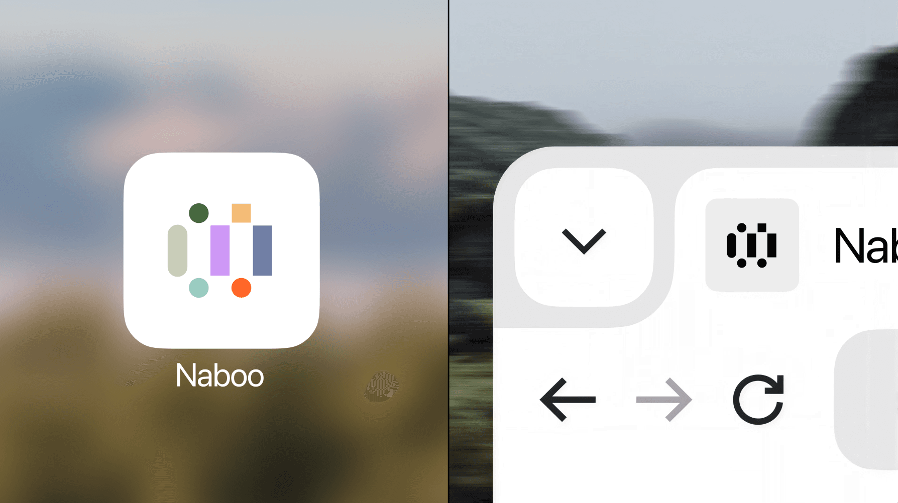
Describe Naboo as a venue marketplace and someone may judge us mainly on the places they can find. Describe us as procurement software and they may look for reporting, policies and savings before noticing the service behind an event.
Neither reading is unreasonable. Each starts from the context we have given them.
That made positioning a practical responsibility: give people a starting point that helps them understand the value of the whole offer. A more impressive adjective was unlikely to do the job.
The clearest conclusion was that serving organisers and Procurement belonged at the centre of our positioning. We had sometimes treated those two audiences as a difficult communication problem. Together, they explained what made the model valuable.
That gave us a practical direction: one Naboo brand, with different starting points depending on who we were speaking to.
An organiser needs to know that we will make their job easier and help them deliver a great event. Procurement needs to understand the visibility, savings and consistency we can bring across the company. Both should recognise the same business behind those promises.
It also clarified the place of technology in the story. AI helps us deliver the service at scale. For the client, the benefit needs to be tangible: a faster answer, less coordination, better advice.
From there, we had an idea we could build around: bringing structure to chaos.
We needed to communicate the scale of what happens behind the scenes while making the experience in front of the client feel clear, human and manageable.
Suddenly, the rebranding had a job to do.
A beautiful homepage would only answer a fraction of the brief
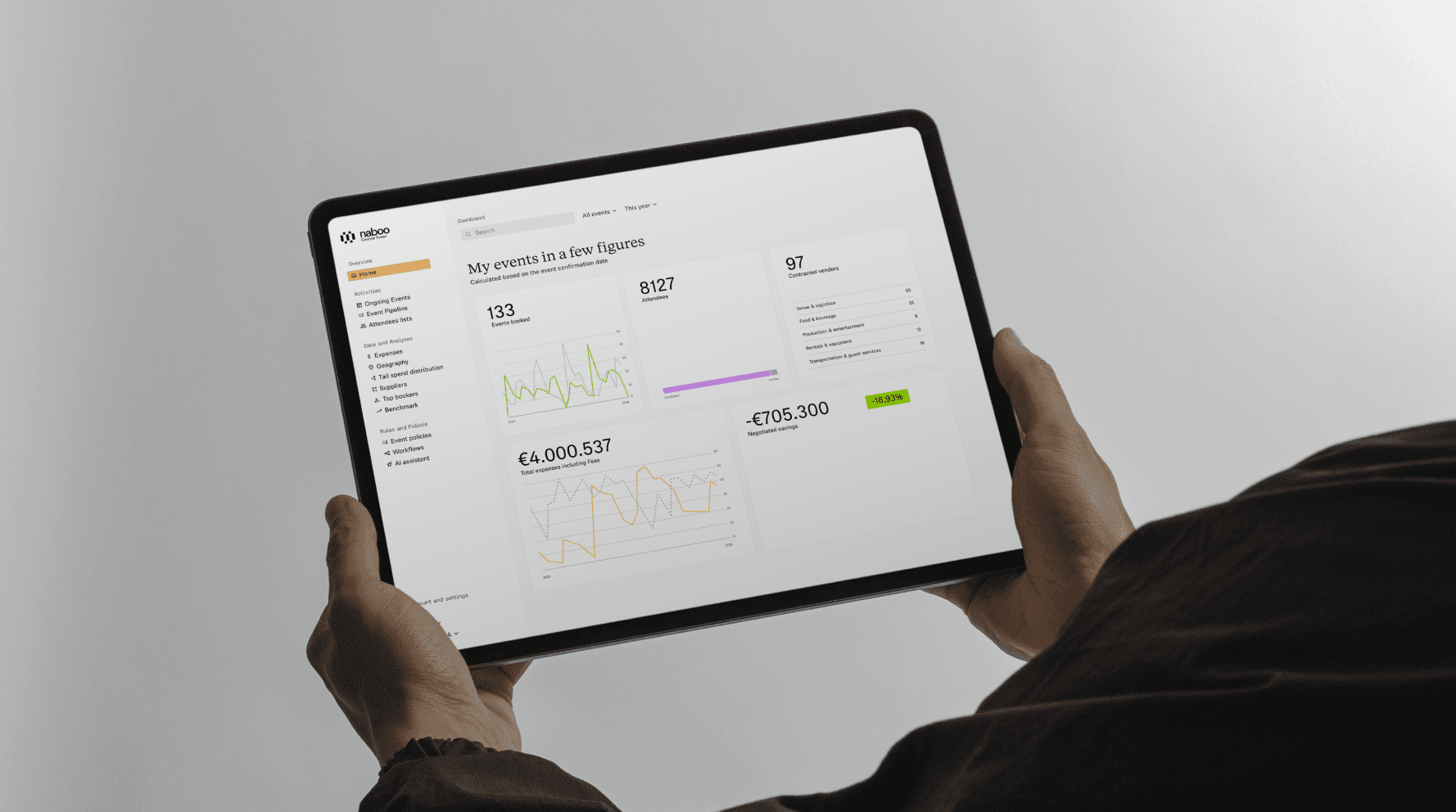
The visual system had to carry that idea into very different situations. It needed to feel credible in a procurement presentation and inviting in a campaign about an exceptional venue.
Working with Bleed meant giving them room to push us, then testing their ideas against the less glamorous realities of the business.
Could the system support a product story? Could it make a dense slide clearer? Could our teams use it without asking a designer to supervise every decision?
Those questions also made the feedback more useful. “I’m not convinced” leaves a creative team with a guessing exercise. “I cannot tell which information matters most on this slide” gives them a problem they can solve.
Kristoffer was central to that translation.
He helped connect the creative ambition with the practical requirements of the product, the website and the people who would eventually use the system. Maintaining that coherence while receiving feedback from every direction is a considerable job.
By the end, we had a clearer way to explain Naboo, a shared direction for how it should look and sound, and a system our teams could build on.
The work on positioning made the design decisions easier to understand. The design then made the positioning easier to see.
Thank you to Bleed for taking the time to understand us, for challenging us without losing sight of what made the company ours, and for helping us reach conclusions we could carry forward ourselves. Given the deadline, taking that time mattered even more.
We now had a direction we could explain and an identity we could use.
Next came the small matter of getting it onto the website, into our tools and into everyone’s working day.
October was still coming. And no designs to be seen.
How did we go from a Powerpoint about our positioning to a full rollout in two months ?
See you next week.